T-shirt design for Mount Sinai Fuster Heart Hospital’s 2026 Wall Street annual run and heart walk, staying within color and type brand guidelines.


Run & Heart Walk Non-Profit T-shirt Design
Graphic Mascot Redraw
Redraw of an owl mascot for the Comprehensive Adolescent Rehabilitation and Education Services (CARES) as part of the Mount Sinai branding coordinates. A heart is added to the owl’s chest, and the eyes now look to the future.

Mount Sinai Doctors Exterior Window Design

Prescription scripts drive the design for a window graphic at Mount Sinai Doctors in NYC. A gradation, from cyan to magenta, is used in a branding system that requires the two colors not to overlap. See the full PDF Exploration.
Rensselaer Architecture Poster Series
Poster announcing the Spring 2025 semester’s lecture series for the architecture department at Rensselaer Polytechnic Institute in NY. Each uses a background image that is meant to create a sense of wonder and exploration for the department.
Gala Event Save-the-Date Card
Save-the-Date card to draw supporters to this fundraiser in New York City using empty frames to reference missing children. Empty frames are used as a motif throughout the promotions for this NYC gala event, from website advertising to gala journal. 
Brand Logo Design for Food Retail
Brand logo design for food retail as part of an exploration for entry into the grain market for Globex International USA.
NYC Wall Design
The vinyl installation of a design made for the Goldwurm Auditorium’s vestibule located at the Icahn School of Medicine at Mount Sinai. The hospital’s branding doesn’t allow for the cyan and magenta mix to touch. 
Logotype and Certificate Design
Christophe Landon, who made his first violin when he was fifteen, is a prize-winning violin maker, restorer, and world-renowned dealer. The logotype mimics the instrument’s scroll at the top of the neck, and the certificate design was printed digitally with UV inks on Cranes 100% cotton paper as the certificate needs to last for a minimum of 100 years.

Professor Charles Goslin (1932–2007)
When you first meet Charles Goslin you can’t help but think: courteous Bostonian gentleman. It could be his demeanor—quick-witted, yet mindful and attentive to your words. His brown tweed jacket, button-down shirt, and English shoes help the equation. In fact, Goslin is from nearby Attleboro, Massachusetts.
In 1954 he received a BFA in graphic design from the Rhode Island School of Design (RISD). One instructor in particular, someone who made a difference for him, was James Pfeufer (1950–1960). “Jim critiqued design projects with the utmost respect. He taught me how to value graphic design.” RISD gave Goslin the craft and inspiration to apply to the top design offices of the day.
Upon graduation, Goslin began working for noted American designer Lester Beall. “The minute I walked into Beall’s studio at Dumbarton Farm, as Beall called it, I knew it was the place for me,” Goslin recalls. “The studio wasn’t decorated with utilitarian color charts or production materials; only framed photographs and paintings, carefully hung alongside choice design projects pinned to the walls…the message was that design not only solved the client’s problems, it also nourished the designer creating the work and the audience viewing the work.”
Bousum Transfer Visual Identity
Bousum Transfer is a waste management company that operates in the transportation/trucking/railroad industry. The visual identity has a tough aesthetic and color that articulates the transfer of hazardous material.
Law Firm Visual Identity
Visual identity for a law firm that meets the aesthetic of their previously designed website, including typeface, color, and geometries. The goal was to find an idea that was reserved but also unique.

Healthy Heart Series Icon Redesign
Healthy Heart Series is an organization that educates people (predominantly women) about heart mortality rates and the complications that lead to cardiac arrests. Their goal is to reduce the disparities in heart disease among various groups through education, outreach, prevention, and intervention. healthyheartseries.org/
Mount Sinai Hospital Wall Graphic
Vinyl installation for a Mount Sinai Hospital wall graphic. The phrase that masks photos of medical students repeats in the horizontal cyan bar. See the full campaign for Mount Sinai.

BJTBronx Street Banner
BJTBronx street banner created for this proud commercial district that Worksight designed the identity for—see the full campaign.

NYC Rapper T-shirt Design
Every so often there’s a request from a rap artist for a logo, cover or t-shirt. They usually have their own idea in mind, which is understandable and totally fine. This shirt was designed for Angel in Hell.

Interactive Form Design
One of 32 form designs for Mount Sinai hospital that can be filled out and signed in Adobe Acrobat. Each question, button, and signature is set to tab through by the patient and either printed out or emailed back. Light blue boxes only appear on-screen to indicate live areas.

Financial Company Logo Design
Logo design for an algorithmic trading firm located in New York City. The goal—to create a visual that coordinates with the precise and direct approach the firm has to market trading. Below, the logo is applied to their website’s home page. The name is inspired by a Japanese sword characterized by a curved, single-edged blade.

Construction Company Capabilities Brochure
Construction company capabilities brochure for Ant Yapi, a Turkish firm starting business operations in NYC. Interior case studies use full-bleed photographs and supportive graphics to highlight their success. Spot gloss accents an overall matte lamination on the cover. See the PDF.
Dentistry Logo Design
This prosthodontist office is planning on expanding to more cities, which explains the embedded P shape inside the circle set. The repeat of the center circle at the end of the name is to confirm that prosthodontists are at the core of serious dental work.

Mount Sinai Brochure Design
Brochure design that serves as a template for the Addiction Institute as part of The Icahn School of Medicine. See a PDF of the full brochure.

Logo Design for NYC Startup
Logo design for JAMM Innovations, a startup that organizes gaming events. The idea uses a “play button” arrow between the A and M to bring energy to this colorful design.

Clutter Cure Logo Design
Logo for a startup business in Texas that helps folks pack, clean, and otherwise organize their stuff. The coordinates of the project were to interpret the process of de-cluttering, their location (Texas—the lone star state), and to somehow reference a magic wand :-).

Presidential Campaign Logo
Visual identity project for Innocent, a candidate running for the presidency of Gabon in Central Africa. The mark at the right of the name is the map of the country and the year, which can split off and be used on buttons, etc.

Startup Logo Identity
Catskill Cryo hired Worksight to develop its visual branding and collateral material. Cryotherapy, which literally means “cold therapy,” is a technique where the body is exposed to extremely cold temperatures for several minutes. Cryotherapy can be delivered to just one area, or you can opt for whole-body cryotherapy. The mark reflects the degree of coldness, the circular nature of the cryo unit, and the double “C” in the name itself.

Voting Campaign
Mount Sinai voting campaign to promote early voting. Created for internal screen projections and posters, this piece ties iconic medical treatments to a checkmark as a kind of mashup to support the statement.

Write to Shine Non-Profit Logo Design
Non-profit logo design for an educational startup helping middle and high school students learn to express themselves through writing.

Lower East Side: People’s Credit Union Annual Report
Online report for the LESPFCU including charts and graphs and highlighting their new mobile banking (cargo van) created as a mockup. See the full report.

St. Michael’s World Apostolate, Bayside, Queens
The 0 in 50 doubles as a halo in this 50th-anniversary campaign logo for St. Michael’s World Apostolate in Queens, NY. Blue (purity) and Red (passion) are the colors associated with the Virgin Mary, as is gold for a 50-year celebration.

Lower East Side: People’s Credit Union Design Campaign
Part of a series of posters, postcards, and buck slips (approximately the size of a dollar bill) for this non-profit credit union on the Lower East Side (below Houston Street). The goal was to use interpretive typography and composition in a fun, upbeat, and legible way.

Design Reviewer
Made it to the top row, third from the left as part of Bejing’s VO/Art Union portfolio review program for design students throughout China.

Marathon T-shirt Design
T-shirt design for an annual Mount Sinai run. From a large exploration this design was chosen because of its typographic simplicity as well as its metaphoric mashup of heart monitor and running shoe.

Branding and Site Design for Tendy Law
Worksight created the visual identity and site design for this New York City-based law firm. Tendy Law provides a sophisticated, boutique outside general counsel practice advising midsized corporations, not-for-profits, and financial institutions regarding all corporate matters. See the site design here.

Graphic Translation
Graphically translating a drawing (for an app icon promoting a STEMI catheterization aid) to line-based vector art begins with a reductionist lens on your eye. The outlines, gone. The inconsistencies in line weight, gone. the gradation, gone. What we’re after is power by the simplest means.

Back Covers
There are times when I like the back cover of a publication that I’ve designed even more than the front cover. It may be that back covers have fewer restraints assigned, allowing more freedom for compositional play. In any case, this is a back of a report I designed a few years ago; enjoy.

Academic Scholarship: Logo Design
Recently completed, this is one of those formal ideas where the cap sat so nicely on the C that it was hard to ignore. Simple two-color mark and lockup.

Design Interview (Podcast)
Thank you Dave Hopkins for the pleasant design interview (lucky 13)!
itunes:
https://podcasts.apple.com/ca/podcast/the-quickie-interviews-for-graphic-designers/id1463743075
Spotify:
https://open.spotify.com/show/6cX7gO7xbN2x2UKkZtVBQd?si=bRaCyjCTQt2szdswKXP_bA

Poster: The Way We Get By
Zenith Productions hired Worksight to design a poster for Neil LaBute’s The Way We Get By. The premise: Attractive singles Doug and Beth meet at a drunken wedding reception and end up having sex at the apartment Beth shared with her control-freak roommate. Unable to sleep Doug wakes Beth in the middle of the night and the two share an awkward conversation before she attempts to rekindle their intimacy. But when her advances are no longer reciprocated Beth demands to know why. Her probing elicits a very surprising response from Doug. Fast-moving, sexy, and surprisingly poignant, The Way We Get By is a comedy about lust, life, and love.

Privately Owned Public Space (POPS)
NYC’s Privately Owned Public Space logo competition: Worksight used a modular pattern to create the P letterform that references stone patterns found in both indoor and outdoor spaces. The mark works in both color and black & white, and includes letters to spell out “POPS” inside.

Aurelian Life
CBD is one of the principal compounds found in hemp that can have many health benefits such as reducing pain and inflammation, relieving anxiety and stress, and improving overall well-being. Worksight worked with Aurelian to develop the naming, logo, and label series for this new and popular product. In fact, Aurelian is a premium CBD in terms of regulation, potent, and purity.
Lotus Health and Wellness Campaign
Worksight designed the logo, brochure, and website for a new Harlem-based health center. Check the site out at lotushealthcenter.org
Satiim Land Rights
Worksight poster design for an organization in Belize helping indigenous tribes retain their land rights.
PUTiN on a World Cup Party
In preparation for the World Cup games, Worksight designed a poster to be hung around East Village establishments to bring fans to The Summit Bar, with proceeds going to #cookforsyria, a global fundraising initiative.

StreetWise magazine
Worksight’s redesign for the Department of Transportation magazine “StreetWise” including masthead design and art direction of photography.
SPOTLIGHT ON THE 2018 WINTER GAMES: WHAT DOES IT TAKE TO DESIGN A MEMORABLE OLYMPIC EMBLEM?
Pratt Institute interviewed Professor Scott Santoro who shared his thoughts on the 2018 PyeongChang Olympics emblem and other exceptional examples from the past.
Gala Journal Design: Purchase College
This gala journal cover is one of my favorites, created for a Purchase College fund-raising event. The brief stated that there would be a white piano on a black stage for a featured entertainer to play. The “bubble P” logo was enlarged and used to represent a piano (center), and the typographic swash elements became motifs that extended throughout the journal. Lighting equipment at the event projected the same swashes onto the stage.
Gravestone Design
While a grad student at Cranbrook Academy of Art, which is just outside of Detroit, I was asked by an art gallery client to design her dad’s gravestone who had died six months earlier. The project included roughs, changes, and refinements, just as a standard job would. But during the final placing of the stone, there were tears and statements by the family, which was quite overwhelming for me as a young designer. Yet, I still cherish the opportunity I had back then to work on something of this nature.
Pace University
An apple is a very popular image and has operated as a sign to represent knowledge (think Adam and Eve’s forbidden fruit), as well as to symbolize elementary education as in “an apple for the teacher,” and also as a sign of health as in “an apple a day.” Here, Worksight used the apple as a kind of piled-on-pride of successes for a Pace University’s School of Education brochure.
Polyglot Press
Logo design by Worksight for the Polyglot Press, a publisher of multi-language books and the republisher of out-of-print classics. The word “polyglot” in fact means: having the text translated into several languages: polyglot and bilingual technical dictionaries. The parrot is used not only because of the letter P but also to symbolize the power of words and the speaking of truths.
Lecture: Graphic Design Is…
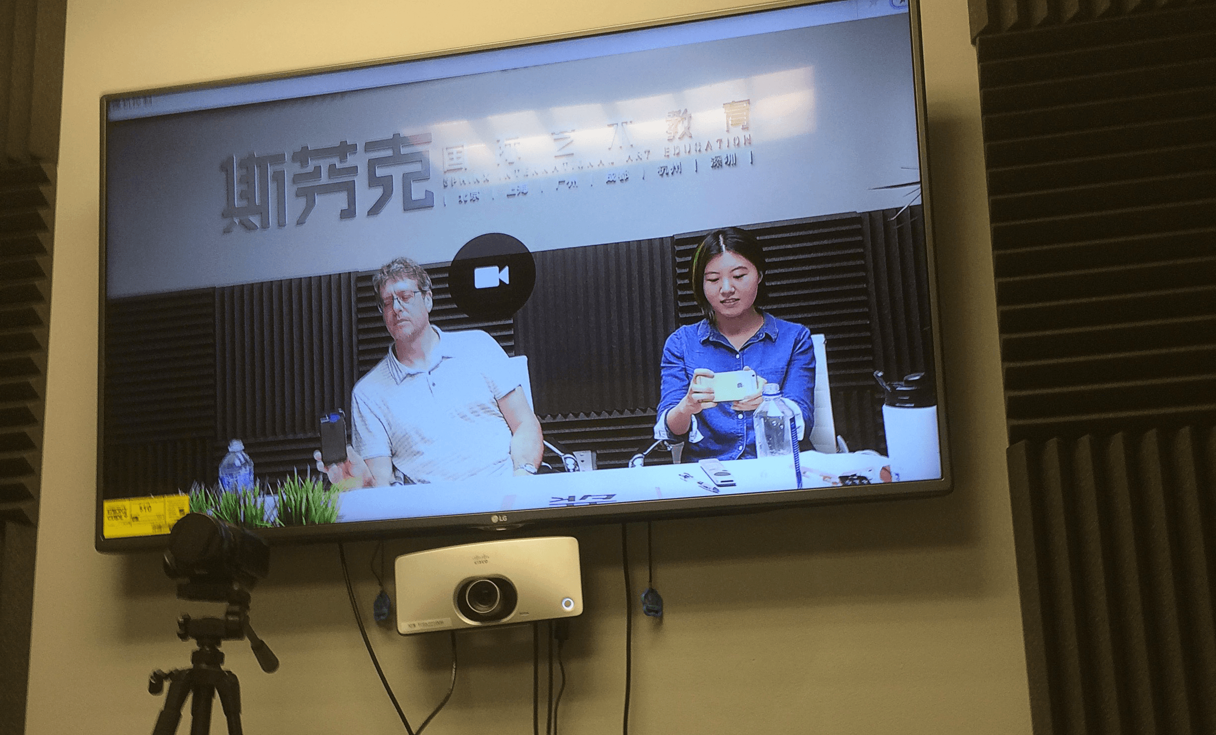
A selfie shot during a lecture on graphic design featuring Pratt student work—presented live to design students in Beijing and Shanghai, China; with Xiaoren Liu (Catherine) per ANO Art China, and their subsidiary, Sphinx.
The YOU in Your Work
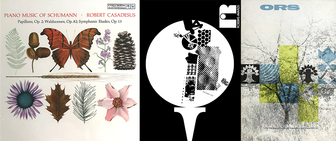
When other people recognize your work, it is a great compliment. They may recognize your humorous attitude coming through the work or see a visual treatment that you have brought to many of your solutions in the past. These distinguishing characteristics reflect your style, which can come through you unconsciously. In fact, your style is you.
The places we’ve been and things we’ve seen, felt or heard all broaden our vision as designers. They also define us. For example, a trip to Vermont to see the foliage could add to your color pallet; an unfortunate visit to a hospital’s emergency room could shock you into realizing how efficient people can be under pressure. In either case, both experiences will be internalized: you will realize that a recent design has a color you never thought about using before, or it has an energized immediacy about it. These influences can come from everywhere. Can you trace them back? The fact that someplace or thing might feed your work is, in effect, acknowledging connections with your larger culture, community, and environment. A good example of this dynamic is a visual series on the impact of the Iraq war by Maria Uroos. She grew up in the Middle East and felt a need to create a visual dialogue about the changes in life, culture, and religion that she saw there. Her tools include text and image, metaphors and analogies, elements, and principles. All convey thoughts about the region where she lived, fleshed out into a form that is meant to extend conversations. Each piece begins with her.


In a design experiment by Janet Lee, whose family is in retail fashion, two activities are merged into one composition. She created a montage of typography with a dress form, color chips with fabric swatches, and single-edge cutting blades with scissors. The art historian E. H. Gombrich (1909–2001) wrote, “Anyone who can handle a needle convincingly can make us see a thread which is not there.” The connection this designer makes to retail fashion isn’t necessarily there either, but is more a myth that forges a connection to something more personal and perhaps more meaningful to her. She uses that same ability to tell stories and making connections when creating works for her clients.

In another piece, Rick Valicenti examines his own future role as a graphic designer. The poster’s purpose is to announce a design lecture in Vancouver, Canada, and the character pictured—a jester that is full of remorse—is a portrait of Valicenti himself. Hanging off his hat is a flickering sign that reads “HUGE.” The ghostlike, wispy image of an old man beside his own face hints at his later life. Together, the images make a social comment about whether this effort is all there is in Valicenti’s future, and for that matter, in the profession as a whole. In other words, designers can be practical problem-solvers (such as finding a way to announce an event), but also passionate artists whose work also matters in terms of making a positive difference in the world.

From Guide to Graphic Design, by Scott W. Santoro, Pearson Education
Also posted on LinkedIn:
https://www.linkedin.com/pulse/you-your-work-scott-w-santoro
Pierre Bernard Memorial
A Thursday night event at the Fashion Institute of Technology remembering Parisian graphic designer, Pierre Bernard, with (LtoR) Leslie Blum (chair and moderator), and speakers, Scott Stowell, Scott Santoro, and Keith Godard.
Cooper Union’s Lubalin Center 30 over 30 Exhibit
Photographed from an exhibit wall at the Lubalin Center in NYC in which designers were asked to comment on various iconic designs as part of the center’s collection. Jessica Helfand and I both wrote about art Director/Designer Lou Dorfsman’s ad, circa 1961, for CBS. The text under the largest “ha” reads, “He laughs best who laughs last”—an ad explaining the broadcasting company’s success in focusing on comedy television.

Bronx-Lebanon Hospital report design
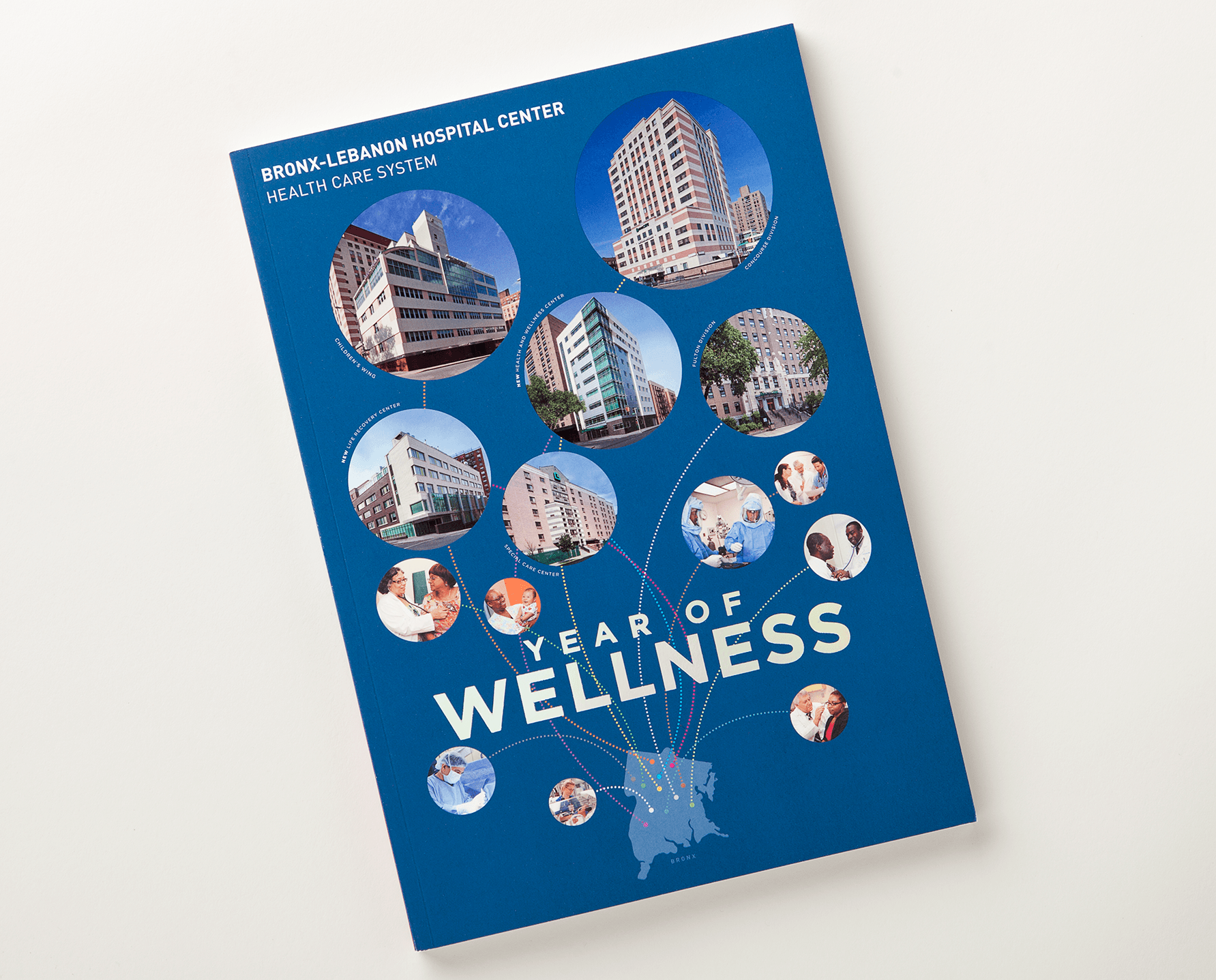
This cover design uses a silhouette of a Bronx map to notate the locations of hospital facilities under the Bronx-Lebanon health care system. The cover was finished with a soft-touch coating and spot gloss lamination over each circle. The design of the interior pages included custom charts and layouts for approximately 64 pages.
From Cave to Code
My young son once asked, ‘Why are we here?’, writes Scott W. Santoro. When the question was flipped back to him, ‘Why do you think we are here, Ellis?’, he responded, ‘To learn stuff!’
Ellis was right. If for no other reason, we’re here to learn stuff, and graphic design makes it easy. Our field is so rife with varied subjects that we can’t help ourselves – it is almost forced upon us.
When Pearson Education asked me to produce a graphic design textbook five years ago, I went through everything I know about the subject, and learned a lot more in the process.

Guide to Graphic Design
A 360-page textbook written and designed by Scott W. Santoro over the course of five years. The book published by Pearson Education is translated into Chinese and Arabic. The last word in the book is, “whew.”
See a website created about the content.

Earthwork
This earthwork by the artist Vik Muniz is funny and amazing at the same time. Much of his work is the combination of sculpture and photograph with a post-Fluxus bend to it.

Australian Design Competition Judging
The image attached is a showing of some of the winning posters that I helped select in a September 2010 judging as part of the Australian Graphic Design Association. The competition had a theme—to explain what graphic design can mean to the community socially, culturally, and financially. This must be what design heaven looks like.
Poster for Tomorrow
Pratt student, Ian Rousey, (an undergrad in the design program) won entry into a worldwide competition in which designers were asked to interpret the phrase “Death is not Justice.” Ian’s poster was completed as an assignment in my Graphic Design 2 class. It is an ingenious use of type and the research of statistics on the death penalty. Shown is the poster (left) sitting next to others being presented on the site. Congrats Ian. See the official site at <http://www.posterfortomorrow.org>
Coney Island
Proud to see a brochure we designed for Gilbert Paper presented in a glass case alongside other memorabilia on a recent visit to the Coney Island Freak Show. The piece documents the history and current state of the island in all its continuous glory and was used by Gilbert to promote their tactile, textured commercial papers.

Brno, the Czech Republic
Photo from a presentation made in June of 2010 in the city of Brno, the Czech Republic, as part of the Brno Poster Biennial. The event included the jurying of a large poster show, exhibition of Worksight graphic design projects, and lecture (as part of a connected symposium), answering the question posed: Are Ideas Enough Today?
An animated icon was made of each presenter, which included Petr Babák (CZ), Oded Ezer (Israel), Andrzej Klimowski (UK/PL), Sato Koichi (Japan), Lizá Ramalho + Artur Rebelo (Portugal), Karel Martens (the Netherlands), Rick Poynor (UK), Igor Stanisljević (Croatia), John Walters (UK), Martin Woodtli (Switzerland), Alan Záruba (CZ).
The Czechs have a rich history of graphic designers creating groundbreaking work including Ladislav Sutnar who taught at Pratt Institute from 1946 to 1949. I received a BFA in graphic design from Pratt and now teach there, and the Czech audience was happy to see a photo of the school and current student work from my senior design class.

Great Jones Street Firehouse
A typical weekend scene while living next to a firehouse (on Great Jones Street) practicing and having fun—and not necessarily in that order. These firemen go out on runs approximately 20 times a day, most of which are false alarms, and never seem to complain.

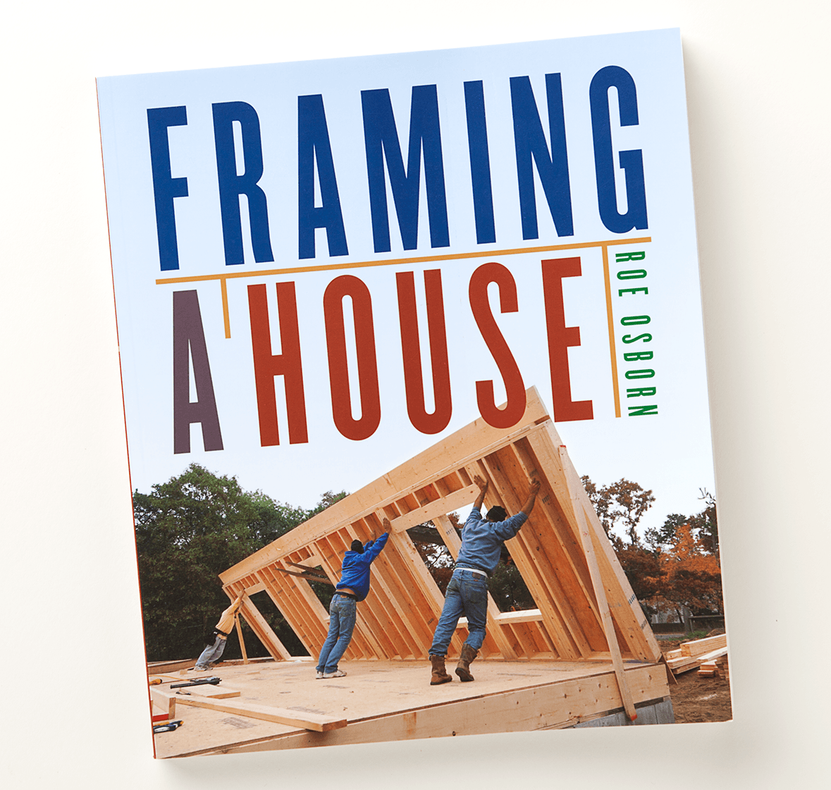
Framing a House
The Taunton Press hired Worksight to design the cover and interior of a “how-to” book titled Framing a House as well as a series of “green” building books including Toward a Zero Energy Home and Green from the Ground Up.
Gummie Bier
Another label for Dr. Benny, this time for his latest creation, Gummie Bier. See Stim-u-ale in a previous blog entry (below). The labels are really used promotionally. They aren’t meant to sell the beer off the shelf but are emailed to Dr. Benny’s friends and family, in order to properly celebrate the latest brew. My payment is in actual beer, and great food (at their party). I consider this a graphic design perk.

Brave Ellis’s first guitar recital.
Ellis (9-yrs-old) was worried about going up in front of his fellow classmates and performing the song he learned to play—his first (The Beatles All My Lovin). Here is a blurry recording (sorry) of how he managed to push through the mistakes made along the way to finish the job. Congratulations Ellis! It’s perfect. Dad.
Making Connections
An embarrassing moment as a graphic design teacher came when I made a comment to a student whose work was static; dead. I wanted her to find a way to liven up her designs and told her she needed to “break out of the box.” Looking for inspiration, I asked what her parents did for a living and she replied, “They own a funeral home, they’re undertakers.”
I don’t think she was being a smart-aleck and I really did have good intentions—it’s just part of the way I teach, to probe a little. The belief is that by looking into past experiences and family histories designers can expand their visual vocabulary and learn to make meaningful connections. I’ve been practicing this myself since 1988, from my days as a Cranbrook student. It was there, in the midst of Deconstruction theory, that I decided to have a personal investment in my method of production.
Plumbing was “it” for me—generations of my family all directing fluids. The metaphor was satisfying, a blue-collar contrast to my white-collar profession. Systems behind the walls became analogous to systems in the mind; tools and processes I knew so well were now consciously massaged, as a layer, into a tough, everyday aesthetic. In the spirit of Magritte’s “This is not a pipe,” the surrealism of word and image became a looking-glass to “see” graphic design better.
Teaching this approach is another matter. It’s hard to get design students to mythologize their lives. And yet, as a teacher, I know that the more input, the richer the output. Ultimately, if I can get design to begin to mean something to them personally, I’ve done my job.
When it works
An undergrad student of mine, Chakaras, had served in the military and had a strong sense of discipline and authority. He allowed his experience to translate beautifully into an investigation of badge-like iconography, and grid systems countered with a kind of typographically distressed snafu—an acronym used by soldiers to mean (s)ituation (n)ormal (a)ll (f)ucked (u)p. The visual metaphor of the military also came out in his research and play with camouflage and gestalt theory. His study opened up an ongoing layer underneath his commercial, problem-solving, graphic design.
When it doesn’t work
The choice not to include one’s past might occur when others expect clichés. No one necessarily wants to be bound by where they’re from or what they did before. Being from India could involve designs that are colorful and ornate, or not; a family of accountants might not offer any exploitable formulas, especially if you hate math; a love for hip-hop doesn’t have to mean that layouts include graffiti—but maybe.
When it’s challenging
Ali showed me his portfolio full of images of human body organs. Short of thinking that pornographic gore was his obsession, I finally had to ask, “where was this all coming from?” Did I even want to know? It turns out that both of Ali’s parents are doctors, and he was on a medical track until graphic design came calling. The imagery found its way in and brought shocking, yet beautiful, mechanisms to his layouts.
Another student, Mike, explained that the metaphor he had found in grad school was none other than Mr. T of The A-Team fame. What’s incredible was how he was able to use this character to drive an examination of pop culture, hero-worship, and celebrity-ism. Eventually, Mike became the persona of Mr. T, including himself, literally, in many of his designs.
The fact that someplace or something might feed your work is, in effect, acknowledging connections with larger systems—culture, community, and environment. The art historian, E.H. Gombrich, who made analytical studies between art and the psychology of perception, wrote, “Anyone who can handle a needle convincingly can make us see a thread which is not there.”
In a sense, connections between personal histories and graphic design aren’t really there either. The value of a link is only made real by believing in it. Not being afraid of seeing yourself in your work is the first step.
Originally published in “The Education of a Graphic Designer” edited by Steven Heller, Allworth Press, 2005
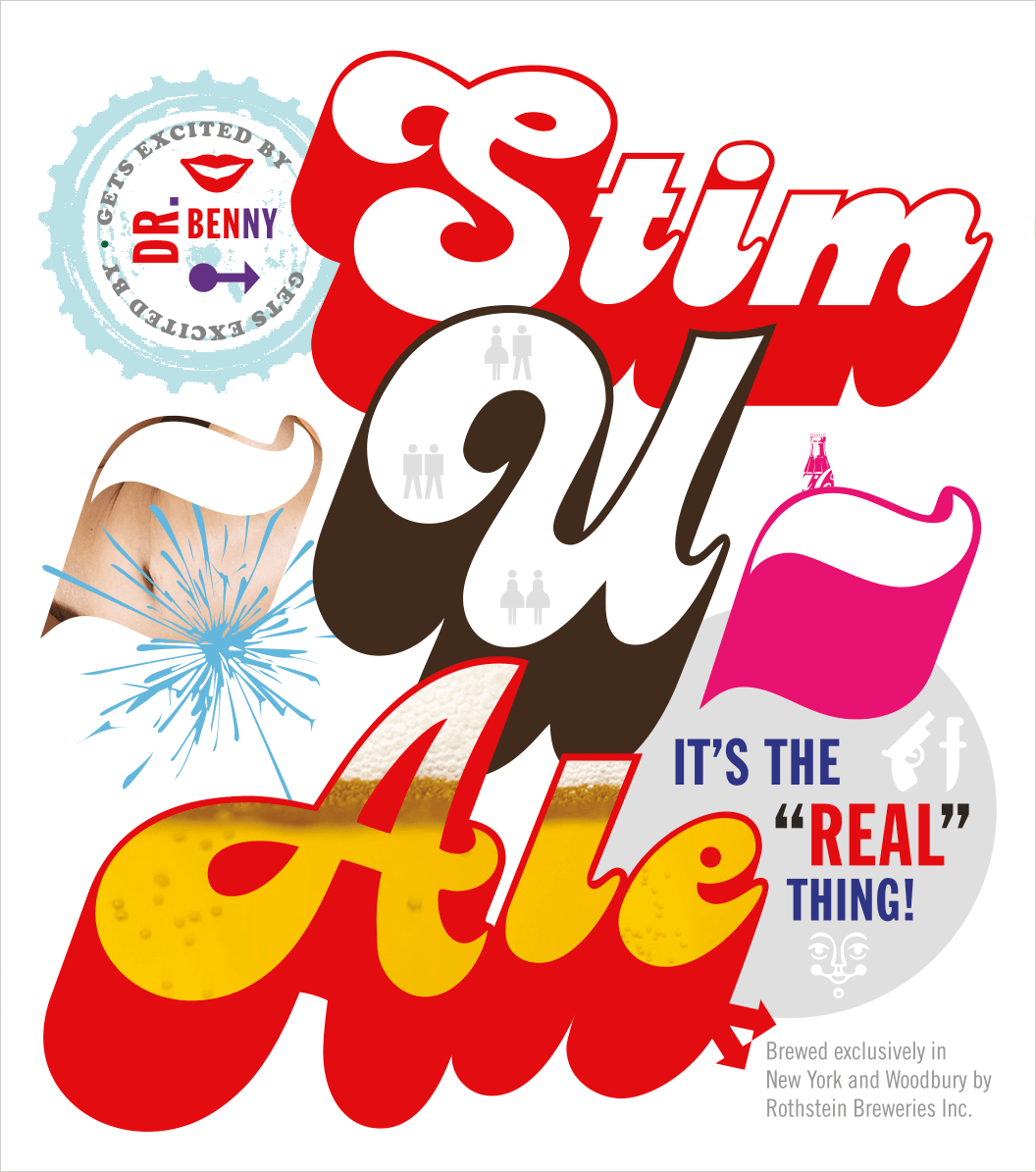
stim-u-ale
An exciting project came through the studio last week: to design a beer label, with payment being in actual beer. My client—Dr. Benny—was introduced to me at my son’s friend’s six-year-old birthday party. Dr. Benny explained to me after we sang and had cake, that the product’s uniqueness is the coca-cola he added to the recipe. I believe I’m only getting five bottles for my time—maybe that’s all the design is really worth—but it might be enough either way. The best part, after all, is that I was able to find a fun use for an early 1970’s typeface by Ed Benguiat called “Charisma.” Must have found its way into my type archive via a publishing catalog we were designing years ago. But how often does a designer get to use a personality-loaded typeface like this one in a seriously not-so-serious way!
