An embarrassing moment as a graphic design teacher came when I made a comment to a student whose work was static; dead. I wanted her to find a way to liven up her designs and told her she needed to “break out of the box.” Looking for inspiration, I asked what her parents did for a living and she replied, “They own a funeral home, they’re undertakers.”
I don’t think she was being a smart-aleck and I really did have good intentions—it’s just part of the way I teach, to probe a little. The belief is that by looking into past experiences and family histories designers can expand their visual vocabulary and learn to make meaningful connections. I’ve been practicing this myself since 1988, from my days as a Cranbrook student. It was there, in the midst of Deconstruction theory, that I decided to have a personal investment in my method of production.
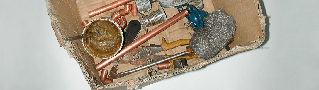
Plumbing was “it” for me—generations of my family all directing fluids. The metaphor was satisfying, a blue-collar contrast to my white-collar profession. Systems behind the walls became analogous to systems in the mind; tools and processes I knew so well were now consciously massaged, as a layer, into a tough, everyday aesthetic. In the spirit of Magritte’s “This is not a pipe,” the surrealism of word and image became a looking-glass to “see” graphic design better.
Teaching this approach is another matter. It’s hard to get design students to mythologize their lives. And yet, as a teacher, I know that the more input, the richer the output. Ultimately, if I can get design to begin to mean something to them personally, I’ve done my job.
When it works
An undergrad student of mine, Chakaras, had served in the military and had a strong sense of discipline and authority. He allowed his experience to translate beautifully into an investigation of badge-like iconography, and grid systems countered with a kind of typographically distressed snafu—an acronym used by soldiers to mean (s)ituation (n)ormal (a)ll (f)ucked (u)p. The visual metaphor of the military also came out in his research and play with camouflage and gestalt theory. His study opened up an ongoing layer underneath his commercial, problem-solving, graphic design.
When it doesn’t work
The choice not to include one’s past might occur when others expect clichés. No one necessarily wants to be bound by where they’re from or what they did before. Being from India could involve designs that are colorful and ornate, or not; a family of accountants might not offer any exploitable formulas, especially if you hate math; a love for hip-hop doesn’t have to mean that layouts include graffiti—but maybe.
When it’s challenging
Ali showed me his portfolio full of images of human body organs. Short of thinking that pornographic gore was his obsession, I finally had to ask, “where was this all coming from?” Did I even want to know? It turns out that both of Ali’s parents are doctors, and he was on a medical track until graphic design came calling. The imagery found its way in and brought shocking, yet beautiful, mechanisms to his layouts.
Another student, Mike, explained that the metaphor he had found in grad school was none other than Mr. T of The A-Team fame. What’s incredible was how he was able to use this character to drive an examination of pop culture, hero-worship, and celebrity-ism. Eventually, Mike became the persona of Mr. T, including himself, literally, in many of his designs.
The fact that someplace or something might feed your work is, in effect, acknowledging connections with larger systems—culture, community, and environment. The art historian, E.H. Gombrich, who made analytical studies between art and the psychology of perception, wrote, “Anyone who can handle a needle convincingly can make us see a thread which is not there.”
In a sense, connections between personal histories and graphic design aren’t really there either. The value of a link is only made real by believing in it. Not being afraid of seeing yourself in your work is the first step.
Originally published in “The Education of a Graphic Designer” edited by Steven Heller, Allworth Press, 2005