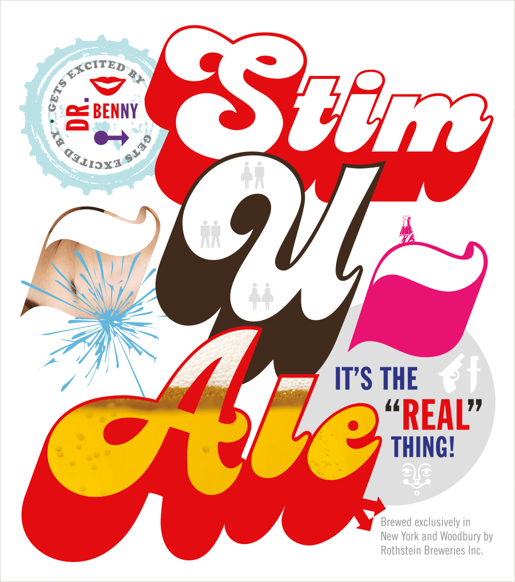
An exciting project came through the studio last week: to design a beer label, with payment being in actual beer. My client—Dr. Benny—was introduced to me at my son’s friend’s six-year-old birthday party. Dr. Benny explained to me after we sang and had cake, that the product’s uniqueness is the coca-cola he added to the recipe. I believe I’m only getting five bottles for my time—maybe that’s all the design is really worth—but it might be enough either way. The best part, after all, is that I was able to find a fun use for an early 1970’s typeface by Ed Benguiat called “Charisma.” Must have found its way into my type archive via a publishing catalog we were designing years ago. But how often does a designer get to use a personality-loaded typeface like this one in a seriously not-so-serious way!

2 comments
You’re absolutely right, its a rare treat when a designer gets to use such an expressive typeface. Its seems like the fun didn’t stop with “Charisma,” the girl-girl, guy-guy, girl-guy symbols, bubbling up over the “Ale” are great. And Is that an Otter to the right of the -U-?
Looks like fun in a bottle.
All right all …maybe I need to drink a few bottles of the stuff to write something about the 70’s look of the label, since I made it through that wonderful time without any cash stimulus or much ale (no irony intended) but spent a lot of extra hours adding drop shadows to everything I had to letter (and sometimes in perspective at that!) I hope your design helps sell him a lot of beer which could help both the company (hope he has lots of employed helpers) and his potential drinkers…
The comments are closed.