Logo design for an algorithmic trading firm located in New York City. The goal—to create a visual that coordinates with the precise and direct approach the firm has to market trading. Below, the logo is applied to their website’s home page. The name is inspired by a Japanese sword characterized by a curved, single-edged blade.
Financial Report Design NYC
Lower East Side: People’s Credit Union Annual Report
Online report for the LESPFCU including charts and graphs and highlighting their new mobile banking (cargo van) created as a mockup. See the full report.
Lower East Side: People’s Credit Union Design Campaign
Part of a series of posters, postcards, and buck slips (approximately the size of a dollar bill) for this non-profit credit union on the Lower East Side (below Houston Street). The goal was to use interpretive typography and composition in a fun, upbeat, and legible way.
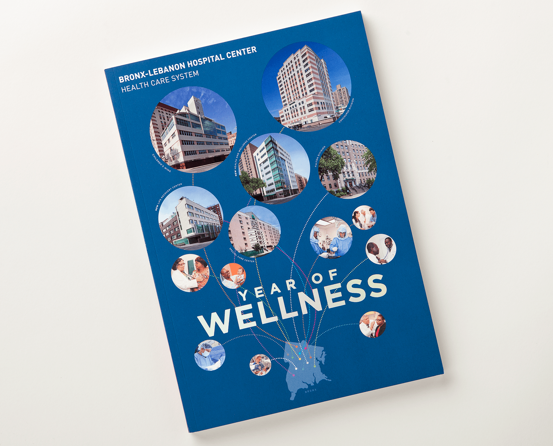
Bronx-Lebanon Hospital report design
This cover design uses a silhouette of a Bronx map to notate the locations of hospital facilities under the Bronx-Lebanon health care system. The cover was finished with a soft-touch coating and spot gloss lamination over each circle. The design of the interior pages included custom charts and layouts for approximately 64 pages.